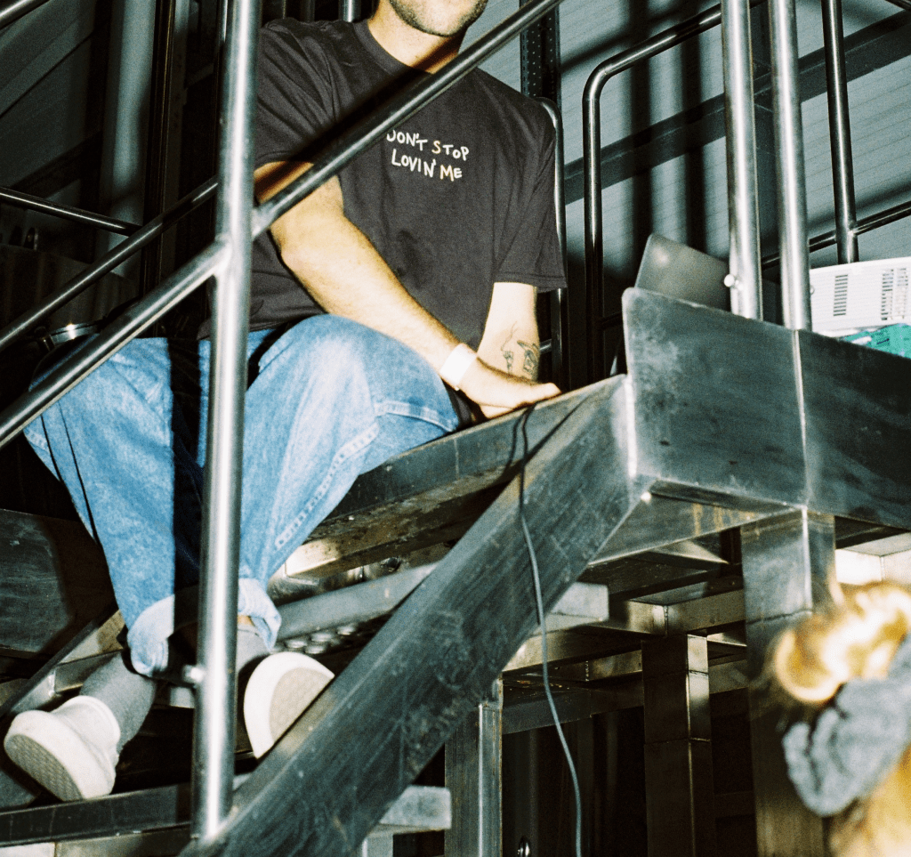
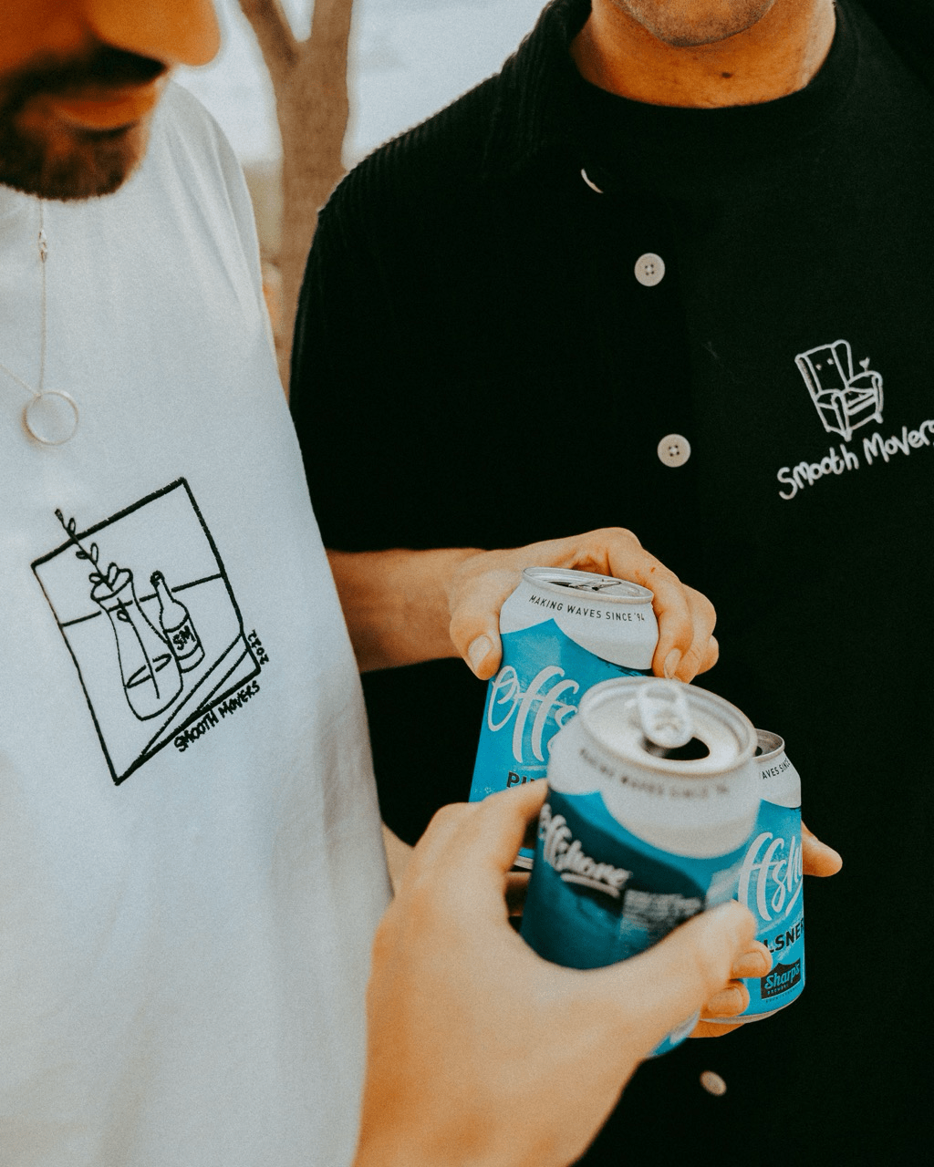
Smooth Movers had been running for a few years before my involvement, so it already had a recognisable brand identity consisting of handwriting, illustrations and an informal and friendly aesthetic.
To maintain consistency between my work and the events’ previous designs, I stick to a similar style of hand-rendered work but with a polished and clean look, and a more cohesive colour scheme throughout the outcomes (theme dependent).
I am creatively responsible for every element of the festival’s visual identity, including social media material, posters, banners, infographics, venue dressings, and merchandise.